Teaching Missions International

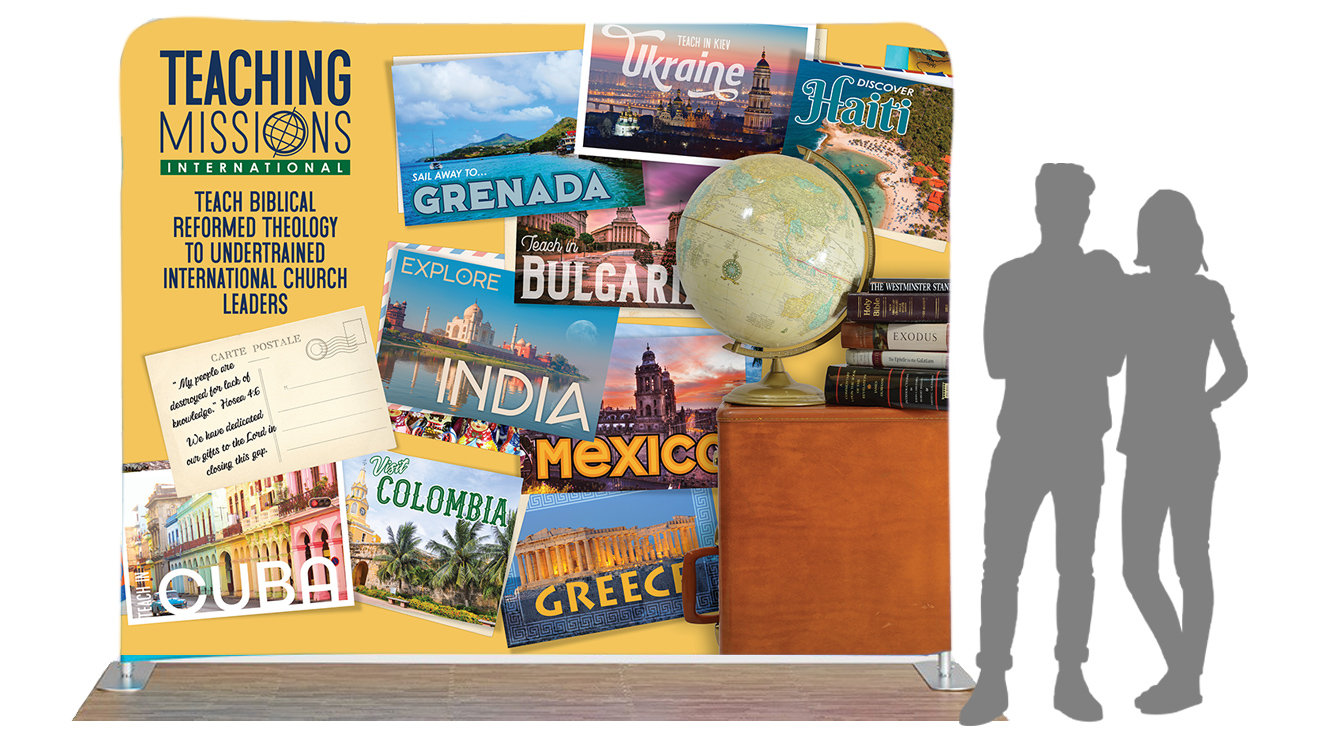
mockup of the Teaching Missions International exhibit booth

Client
Teaching Missions International

Project
Logo and Branding

Year
2019

Challenge

This nonprofit—Teaching Missions International—needed a logo and branding. They were planning to expand their reach and attend a national conference and wanted a design to attract potential teachers, as well as donors.  

Solution

Wild Olive Design created a logo that gives the viewer an instant understanding of the work this nonprofit does. The collateral material, exhibit display, brochures, and promotional items, elaborate further on the concept of teaching biblical theology across the globe.

Products & Services

  • Logo
  • Brochure
  • Promotional items
  • Exhibit design
  • Art direction for photo shoot

The logo for Teaching Missions International. The emphasis on “international” is made using a globe for the letter “O”.

Watch the video showing the thought process behind the logo design for Teaching Missions International. This is the original presentation made to the client. Using Loom video format provides the viewers opportunity to comment on the presentation and to share it with others.

Branding

Once the logo was finalized, it was time to apply it to the all important exhibit display. Watch this video to see the three concepts shown to the client. The audience for this exhibit was primarily teaching and ruling elders in the Presbyterian church.

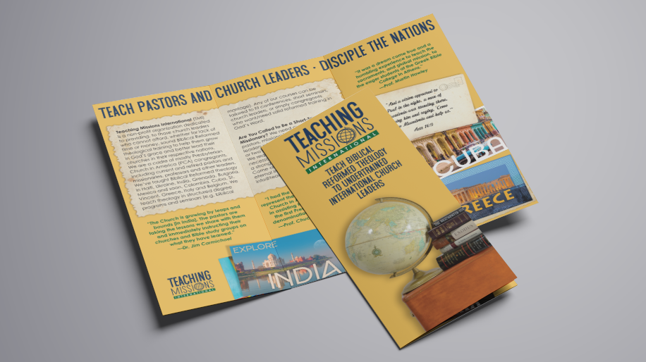
The tri-fold brochure, following the current branding, gives the client an excellent handout for prospective professors.

Polo shirt with logo on left breast.
A variety of end uses for the branding, such as polo shirts, promotional items and stationery, were recommended to the client.
Teaching Missions International Booth

The display in action. Client liked the tourist postcard concept as a way to show all the areas served by the organization. The bright and colorful nature of postcards is a great way to draw in the conference attendee to learn more. Postcards were arranged according to client input. The suitcase and globe took on a retro look and book titles from a pastor’s library were incorporated. 

I'm ready for branding